Please have a look at the following maps and discuss how they can mirror and/or mask and/or manipulate our view of the world. What do these maps reveal about "Canada" and it's relation to other people?


You may also want to listen to the following short clips about the topic:
and:
and:

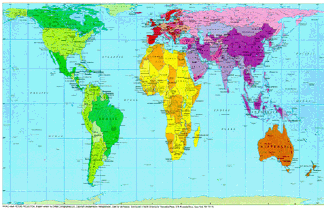
Peters Map - with Correct Proportions & Sizes
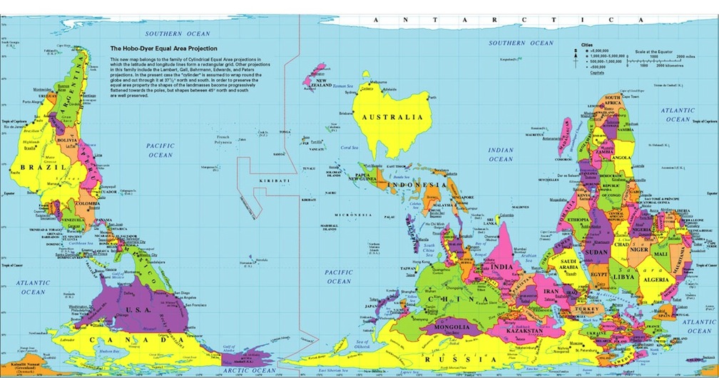
Upside-Down Map - with Traditional Proportions & Sizes

Upside-Down Peters Map - with Corrected Proportions & Sizes
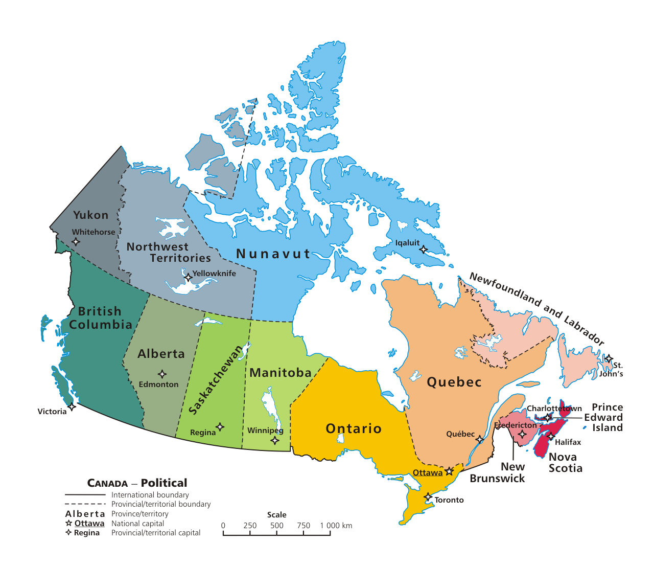
Canada's Provinces
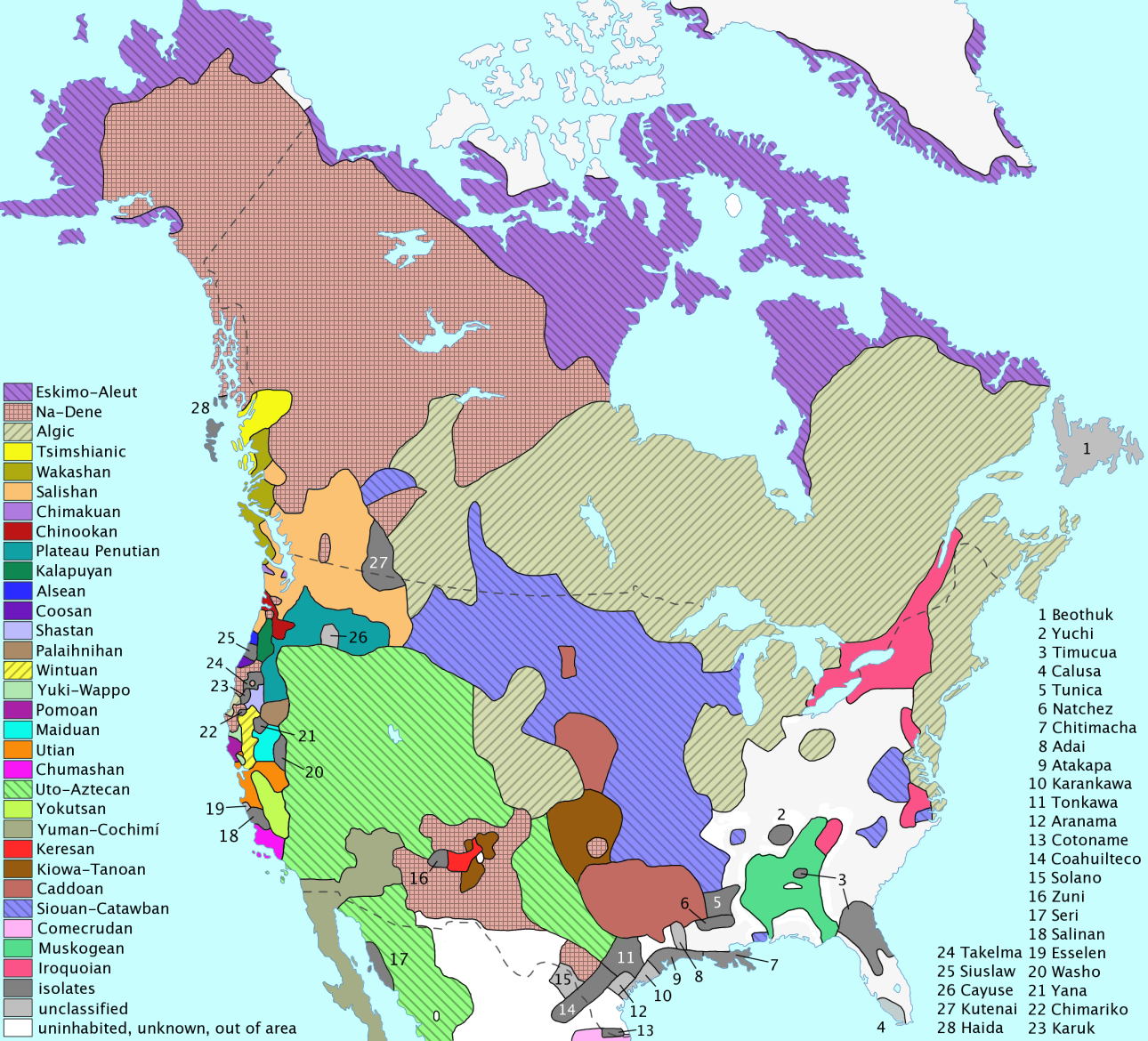
North America's First Nations (Canada & US)
First Nations in BC (Map 1)
First Nations in BC (Map 2)
When comparing the Traditional Euro-Centric Mercator Map to the Peters Map, one can see that there is a very distinct difference between the two in terms of the proportions and sizes of the countries’ land masses. On the northern hemisphere of the Traditional map, places such as Russia, Canada, and Greenland appear to dominate much of the space on the map, while continents such as Africa and South America appear to be only slightly larger than Australia. As well, Antarctica on the bottom of the southern hemisphere can be barely seen. Compared to the Peters map that has the correct proportions and sizes of these areas, one can notice that Antarctica is much more visible and that all of these countries and continents have been corrected.
ReplyDeleteThe disproportions in the Traditional map can cause some confusion and also manipulate one’s view of the world. It can also be seen as a reflection of the possible power that is equated with each of these land masses in terms of how they are proportioned on the Traditional map. As mentioned in the clip of the scene from The West Wing, this would mean that one’s perception of the power of each country would be manipulated, where one may be inclined to believe that the larger land masses such as Russia, Greenland, and Canada, are more powerful than smaller land masses such as Australia, South America, or Africa. The disproportionate depictions of these countries and continents can create the illusion that some of these places are perhaps even more important than others. Therefore, the Peters Map gives a much more realistic representation of these countries and continents, which could help stop the impression that masks some countries and continents as more powerful or important than others.
In comparing the two different maps, one can see that the traditional Euro-centric map - through the sizing and distribution of the continents - is meant to distort one's view so that the "top" Western countries come off as of more importance and influence than the "bottom" non-Western countries. In shifting our positive perceptions towards certain nations, it enables the current power dynamic of the world to be set: one where the West is invariably dominant and of more value. The Peters map on the other hand indicates the opposite, with South America and Africa larger and centered. Unfortunately, there are still many things I see using the traditional map - like on notebooks and wallets - and naturally it will take more than geography to shift people's perceptions towards continents (and thus, the cultures present there) but it is a step in the right direction and an important start in combating racism.
ReplyDeleteIn terms of Canada, I find it interesting comparing the official borders to those of the First Nations tribes. It reminds me that borders are never set in stone - where one place begins and another ends can change depending on our own perceptions. Even official borders change with every battle, treaty, etc. What even makes a "country" depends on how people define one; it seems to me that many places are defined by the community that lives there, which leads me to think that what makes a country is not largely physical but more so dependent on the people (and where they have chosen to settle). I wonder how our perceptions of the world and nationality would change if borders - and the countries as we know them - ceased to exist, especially in the case of immigrants.
When viewing the two Canada maps of both Canada's official provincial borders and the borders of Canada's First Nations, I'm very much intrigued by the notion that the initial borders of Canada could still be very much implemented besides the official Provincial boundaries. Just because groups of people were raided off their lands and ethnically destroyed, doesn't eliminate their own status and lands rights. First Nations were residing in North America long before the British or the French even arrived and to this day we as a country should still recognize their initial borders. I believe the First Nations boundaries demonstrate the borders of communities, where as the Canadian provincial borders demonstrate treaties, battles, and physical characteristics. The First Nations borders make me think of the Yugoslavian borders as those states were divided based upon communities of certain people. The Canadian borders make me think of American borders as they act in a very similar sort of way and were created very likely. Both maps show two different ways one can envision division within the world. As well, the upside down map of the world and the upright map of the world show two different perspectives of borders. Personally, I disagree with the upside down map as there are 7 related north pole destinations all leading to the northern part of the northern hemisphere. That information one cannot change by simply flipping the world map. The structure of the earth is tilted but still upright as we have correctively believed over hundreds of years. There is no changing that.
ReplyDeleteThis comment has been removed by the author.
ReplyDeleteWhen comparing the maps, one can see that the size and proportions of the land masses differ. In the Traditional Euro-Centric map, the Northern Hemisphere dominates the majority of the space on the map. Also, countries such as Canada and the US are a lot bigger than Africa and South America. Furthermore, Africa and South America appear to be the same size. In contrast, the usage of the correct proportion and sizes in the Peters Map portrays the world differently. Countries like Canada and the US are a lot smaller than Africa and unlike in the Traditional Map, Africa and South America are not the same size.
ReplyDeleteBy adjusting the size and proportion, the way in which we perceive the world can change. The disproportions of the sizes can manipulate the way in which we view different land masses and their influence on the world. Larger land masses could be equated with more power and importance. Also, since they dominate the majority of the map it catches our attention. Therefore, it furthers our perception of the importance of these land masses. Thus, the Traditional Map seems to mirror the ideology of a Western dominated world.
In comparing these maps, it’s easy to see the power of cartographers. Human identity is deeply intertwined with one’s relationship to land – the land where we are born, the land we claim ownership to and our land relative to the lands of others – therefore the shape, size and positioning of our land has a great effect on how we value ourselves. On the traditional Euro-centric map, Western nations in the Northern hemisphere are portrayed as bigger and higher than other nations. The larger land mass portrays strength and power, while the positioning near the top of the globe is in accordance with the Christian values of God and Heaven being above, while Satan and Hell are below. Anything upside down is considered wrong or unnatural even though the earth has two poles, neither of which determines earth’s true orientation as it is floating in space. Regardless, because we cannot easily view the earth from above with our own eyes, it is difficult to truly grasp the landscapes we inhabit. Maps however are material and easily viewable.
ReplyDeleteIf you are looking for your homeland (a place you deeply associate with your identity) on a map and you find it represented as a small shape positioned underneath other nations, it may affect your sense of worth relative to those nations and the people of those nations. Or if you find that your nation is quite large on the map and positioned above them, it may lead you to believe that you are superior to those who live in those lesser nations. Our common sense as adults tells us that these images are wrong, disproportionate, but deep down, maps that present different representations look strange or wrong. The images we are taught as children, like the Euro-centric map, stick with us. Children don’t question their teacher because they themselves have nothing else to compare it with. Personally, as a child I always wondered why Canada wasn’t the most powerful nation on the planet because it took up so much space on the world map.
It is only human nature to want to portray ourselves, and the places we live as superior. Positioning, size, orientation and illustration are tools that have been used for millennia in making nations look stronger or more important relative to their neighbours. Roman maps positioned their empire in the centre, filling neighbouring countries in on the sides and below in less detail. Maps in the 12th Century and onward, featured monsters in areas unexplored making foreign land not just strange because it was unknown but also dangerous. Map making has always been an egotistical art.
If anyone is interested, here is a link to an article from The Atlantic featuring maps throughout history that have clear biases and in turn interesting inaccuracies: http://www.theatlantic.com/international/archive/2013/12/12-maps-that-changed-the-world/282666/
I think that these maps reveal a lot about truly how diverse Canada is. It is interesting to see how complex even British Columbia (despite it only being a little representation of Canada as a whole). It goes to show how we shouldn’t generalize and label these cultures as one. It leads me to question, if one province is this fractured, how much more would Canada be as a whole?
ReplyDeleteAdditionally, the upside down Peters map can really question our perspectives and attitudes surrounding Euro-centric thinking. I’ve grown so used to the upright Mercator map that it takes time to even recognize that perhaps the map doesn’t even correctly represent the position and size of the land-masses. It had never really occurred to me that these weren’t appropriate sizes. Perhaps this lack of knowledge is an indicator of how much we take for granted. Should we question and examine our own thought processes?
It is noticeable how the sizes of the countries are changed in the Peters map. Generally Europe and North America, especially Russia is gigantic in the Mercator Map. However to compare this with the Peters map, Africa and South America are larger. I think it reveals a greater underlying attitude of superiority with relations to the other countries. Historically, Europe was the centre of colonialism and many of the countries in the continents of Africa and South American were exploited. I wouldn’t be surprised if that was one of the many reasons why it is depicted like this.
Maps are a really interesting thing that I hadn't thought about much before this year - Wikipedia defines them as "symbolic depiction" while if you had asked me, I would've thought they were meant to be a kind of scientific "truth".
ReplyDeleteIt's very interesting to consider the world map as we commonly know it as a construct designed to prioritize the Western world. In my Medieval English class, we had briefly discussion T and O maps which have Jerusalem at the top or center as it was an incredibly important city for religious reasons. There seems to be a similar sort of idea here.
Thinking of Thomas King, it's also interesting how maps can be seen as part of an act of conquest, of making everything known. As a kid, I used to like to collect maps from places like amusement parks or subway stations, and thinking back on it, I probably really liked having such an organized and informative sort of diagram. It's strange to think about how important maps can really be, in different contexts.
Maps are able to portray very different ideas even though they might all seem to show the same continents and countries around the world. The shape, size, color, as well as angle all contribute to express maps in a different way. Their relevance is often portrayed by the size they are given, or maybe the color they are filled in. When looking at the maps of Canada one can see how detailed they are concerning the aboriginal people residing in Canada are distributed. Areas that are defined so distinctly depending on a specific group or language could never have been depicted in a world map. By focusing down on one specific country one is able to identify details and learn so much more about that country. A world map overlooks all these details preventing one to really learn how deep a country's divides and cultures might spread throughout it.
ReplyDeleteMaps, like any form of literature, reflect the intentions and ideas of the creator, or whoever commissioned the work. Through these maps, we can see that Canada is viewed from very diverse viewpoints, yet at the same time, there are many discrepancies that show blatant discrimination. For example, the tradition Eurocentric model is obviously Eurocentric, displaying a traditional empowerment for the colonizers. Definitions of territory, ethnicity, culture, resources, etc. all play important roles and are utilized by cartographers in order to prove a point. So whether they are cataloguing physical, geographical landscapes, or societal, subjective landscapes, they show intended biases. I find it particularly interesting that in the last two maps, neither have many lines that dictate exactly what territory belongs to who as opposed to the all of the other maps. This could either indicate the erasure of First Nations lands, or merely that there is no need for clearly possessive definitive lines.
ReplyDelete